Infographics – economy & science
The first thing that got my attention about this NY Times article is the title – Why Is Her Paycheck Smaller? Then the trend in the graphic reminded me of lines I see in student achievement and student growth data.
THIS is just too cool! If you are near Grand Central Terminal in NYC you should take time to see the 3D infographics display. And if you are not going there, take the time to watch these short videos (each under 3 minutes). If you teach economics, geography, history, statistics, or any “global” thinking course, how might you use this information? What can we do in education to engage all stakeholders at this level with the mounds of data to which we have access? Next step…once engaged, what paradigm changes or disruptive innovations can we cause such that ALL kids learn and grow the most they can?
- FT Graphic World Live – project installation and beginning
- The Global Economy – fascinating statistics about everything from education to drinking worldwide
- Recession and Recovery – the rays of light in global economy
- Money Talks – cell phones transforming world economy
The details about this display are found at Financial Times Graphic World.
The Scientific Visualization Studio is a repository of engaging visualizations of a variety of earth and space science from the Goddard Space Flight Center. Due to the dry weather winter we’ve had, this one about snowfall caught my attention.
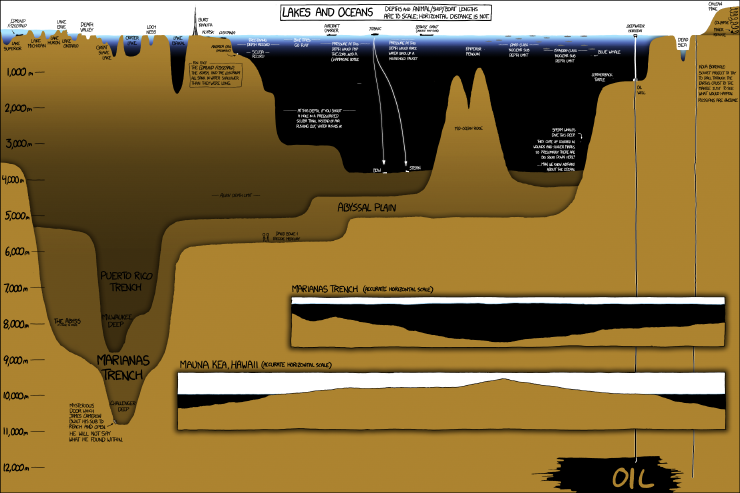
Because I recently shared a different kind of visual about the ocean, this one about ocean currents also caught my attention.
Just a quick shout out to Nathan Yau and his Flowing Data blog, which I have followed for a couple of years now. Many of the infographics shared here were found as a result of his blog.
